

In the first semester of my senior year I took Serigraphy (screen printing). I'm glad I managed to hit three out of the four major printmaking classes (lithography will have to wait), but it was a bit of a strain trying to manage this along with thesis. Thesis of course was paramount, especially since I was on a team, so unfortunately whenever I encountered a hitch in my work I did not have the time resources to go back, redo, fix, or properly test ideas I was trying out - time was so limited as it was. As result, I wasn't technically satisfied with most of these projects in the end and not all of the them will make it to the blog. My first print went of without a hitch though! It was a three color print on paper, edition of 10. Below is a bit of explanation of the elements.
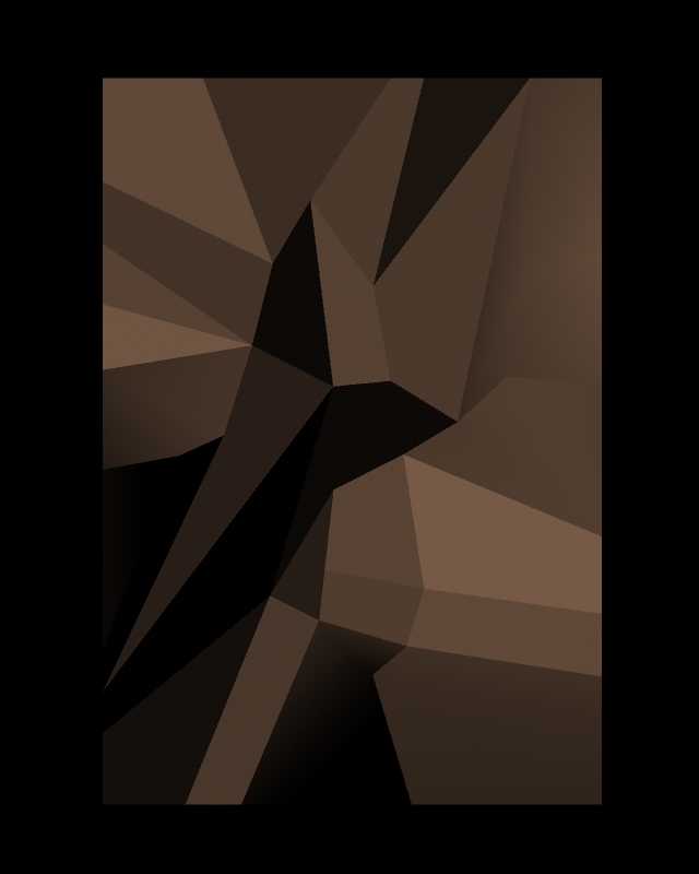
Being in senior year where everything is about polished 3D work I was really dying to use 3D in a "wrong" way. It was one part me not wanting to follow the conventions of that department for once and part sheer fascination with how 3D programs are set up to operate. The starting point here was a poly plane that I skewed around the insides of and edited in an straight view.

I've also been fascinated with dither patterns, especially more recently. They're very simple, but their occasional irregularities produce interesting patterns when tiled that in a way become a recognizable alphabet of gray scale. There's also a kind of fondness associated with them thanks to computer graphics of the 90s. This is the pattern for 35% black.

yeah, tiled.

The next step for me was to apply the dither as an image texture to my poly plane. Normally that would be boring - but I didn't touch the UVs on it so they were still all messed up from me dragging verts around and screwing up the topology. Consequently, I ended up with a pretty interesting landscape of pattern.

Running with those elements I came up with this mock-up in photoshop from which I made my transparencies. The rest is process!
