

Showing posts with label process. Show all posts
Showing posts with label process. Show all posts
Wednesday, November 21, 2012
dress-up

Monday, November 19, 2012
don't cry over spilt milk

Monday, October 22, 2012
35%

In the first semester of my senior year I took Serigraphy (screen printing). I'm glad I managed to hit three out of the four major printmaking classes (lithography will have to wait), but it was a bit of a strain trying to manage this along with thesis. Thesis of course was paramount, especially since I was on a team, so unfortunately whenever I encountered a hitch in my work I did not have the time resources to go back, redo, fix, or properly test ideas I was trying out - time was so limited as it was. As result, I wasn't technically satisfied with most of these projects in the end and not all of the them will make it to the blog. My first print went of without a hitch though! It was a three color print on paper, edition of 10. Below is a bit of explanation of the elements.
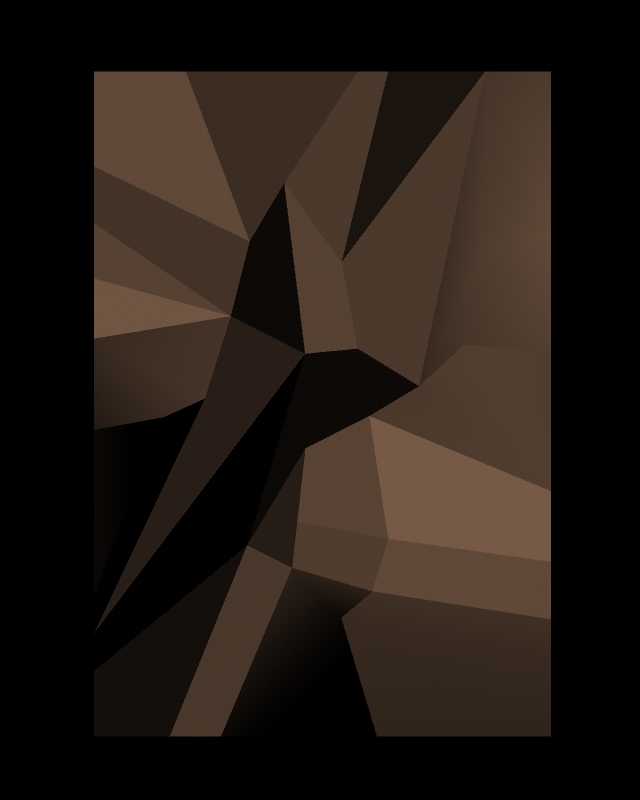
Being in senior year where everything is about polished 3D work I was really dying to use 3D in a "wrong" way. It was one part me not wanting to follow the conventions of that department for once and part sheer fascination with how 3D programs are set up to operate. The starting point here was a poly plane that I skewed around the insides of and edited in an straight view.

I've also been fascinated with dither patterns, especially more recently. They're very simple, but their occasional irregularities produce interesting patterns when tiled that in a way become a recognizable alphabet of gray scale. There's also a kind of fondness associated with them thanks to computer graphics of the 90s. This is the pattern for 35% black.

yeah, tiled.

The next step for me was to apply the dither as an image texture to my poly plane. Normally that would be boring - but I didn't touch the UVs on it so they were still all messed up from me dragging verts around and screwing up the topology. Consequently, I ended up with a pretty interesting landscape of pattern.

Running with those elements I came up with this mock-up in photoshop from which I made my transparencies. The rest is process!

Tuesday, May 29, 2012
a post about pie
So, if you didn't already know, I spent this last year working on thesis with my buddies Adam Campbell and Uri Lotan. We can't put the film online yet since we're submitting to certain festivals, but we cut together this trailer to give you a peek if you haven't caught sight of the film yet! (You should fullscreen it!) We've also got a Facebook page running that we'll keep updated with information about screenings, production art, and the eventual online release.
Now that I've graduated I've been going through all the boxes of papers and miscellany from the past four years. The other day I found my first page of pie doodles. Now, most people might not know this, but The Ballad of Poisonberry Pete did not start out as a thesis idea. We had a day off from school, and instead of doing homework like we probably should have, we wanted to be like all the cool kids at other schools and decided to make a 24 hour film instead. Needles to say, we didn't finish but we pulled the idea back out later during round two of thesis pitches. This page is from that very first idea session where Adam, Josh, and I went to Uri's house after the labs closed, somehow thought cowboy pies were a funny idea, and proceeded to make stupid jokes and stupid drawings until 3 in the morning. It was wicked fun.


Thursday, December 15, 2011
sick tissues

The third card I worked on at JibJab was Sick Tissues. The animatic and original sound design was done by my mentor Jeff Gill and the end card was designed by Will Staehle.
This project was a ton of fun all the way through. I was the given the animatic and the option to do it in stop motion. From there I spent several days building the puppets and doing some simple tests to figure out how to approach animation and better understand how the puppets would function. I shot all the final animation in one day (quite a long day it was), and then spent a few more to composite the footage and finalize it.
The original drawings in the animatic were basically cubes with stick limbs and three fingers. They were simple and had a lot of appeal. I decided I wanted to keep that best I could and so made simple wire limbs to be coated with plasti-dip (a black rubbery plastic much like you find on tool handles) (special thanks to Jeremy Fisher for telling me about the stuff in the first place!) The arms were made with braided floral wire and the legs with galvanized wire twisted 2 ply. I then wrapped them in duct tape to bulk them out before dipping. In hindsight I would look for an alternative to duct tape. It ended up stiffening the limbs too much in places, making it harder to bend and harder for it to hold its posed shape. Something a little less resilient like cosmetic foam might have been more forgiving and uniform. Each limb got about 3 coats of plasti-dip and between coats got to chill out on my makshift drying rack of styrofoam with t-pins stuck into it.


The tissue boxes I opened on one side and gutted. I got some scrap wood from a local hardware store and they even cut it down for me. These pieces of wood I epoxied to the inside of the box where the legs and arms would attach. The cardboard wasn't that strong and I didn't want to risk over-stressing it by bending the limbs directly against it - so I brought the wood in as reinforcement. Once dried to the box I drilled holes through them for the arms and legs, cut away the extra plastic on the limbs, untwisted the wires, cut them down, threaded them through the holes in the box, and epoxy puttied them onto the wood reinforcements. They held up quite well during animation.
For the feet we decided against tie downs and went for the simpler approach of building nails into the feet of the puppet to hold it to a block of dense styrofoam. Since the tissue boxes wouldn't be walking all over the place I could foresee no obvious limitations in using nails, and they really worked out great. They were long enough and the foam was strong enough to avoid any torquing issues with puppets falling over when the weight was at an angle.
Animating these guys was super fun. They're basically just a cog with arms and legs, which really simplifies things and helps you stay clear. As I said above though, it was difficult to keep the arms to maintain more extreme curves. This made it almost impossible for the tissue box to put his hands on his face or hold his head. You could bend them there no problem, but they would always bend back some and you'd lose contact. I found this out very quickly in my short animation test. The impromptu solution of clear tape, however, turned out to work rather well for getting hands to stay and was barely visible in the photographed frames. Though, whenever you introduce a fix somewhere other things tend to happen.... In this case the tape, while it was largely fine during the test, started to pull off small bits of the box coating during animation. I would paint fix certain areas as necessary. Another limitation that I ran into was not being able to rotate the box back far enough while it was on its knees. Physical space just didn't allow for it, but thankfully compositing did, and it really helped to boost the impact of the end.
The card was animated on twos with Dragon Stop Motion. A word for the wise though, the twos setting in dragon will still play back as if it were shot on ones, even though it's numbering as twos. I didn't realize this until after doing the final animation, which made things rather difficult along the way. For this card I was to stick to the timing in the animatic as much as possible. In my test I animated a portion of the animatic and I noticed very quickly that the motion was just too fast and started adjusting the timing while I was animating. The test was still fast, and when later corrected, too slow. I tried to hold strong anticipations and important contacts as much as possible to keep things reading. It was when I was finished animating and tried to sync it with audio that I realized that all along it had been playing back at the wrong frame rate. Setting it to the correct rate finally made a world of difference. And, since I had stuck to the timing of the animatic and my x-sheets (x-sheet are so awesome when you're doing stop motion) everything played quite well. Overall I think the mismatch worked out in the end. It made me animate snappier and clearer out of necessity, and the final was better for it.
If you like boring progression reels, check this out! (20mb, 2:40ish) It's a compilation of quick tests and few progression renders of the final. You can see some of the stuff I was talking about here.
Saturday, September 24, 2011
tie the knot
The first ecard I worked on this summer was "Tie the Knot".
It was animated about a year ago, and already had a working edit with some keying and effects. Initially I was just brought on to the card just to do some rotoscoping in areas like the clamps holding the shoes. That didn't take too long, and I was given the choice to work on the backgrounds for it too, which I jumped on. From there I kept doing more stuff like keying, some motion tracking, sound editing, and the end cards until the piece was done.
These are what the raw shots looked like.

And here are the backgrounds I made. Shot three has all the elements separated to create a multiplane effect in after effects. That second row of shoes in the shot is just the first row of shoes duplicated and moved around.


Props that needed repeating I would make as assets and then skew as needed. I Dug through some psds and made these gifs. It's so much the actual progression, just turning layers on/off, but you get the idea. (click them to see them not cut off)


For the end cards I made the lettering out of shoe laces! I pinned them to a template (printed backwards to keep the backside of the letters as the working surface) and super glued them to hold their shape.


It was animated about a year ago, and already had a working edit with some keying and effects. Initially I was just brought on to the card just to do some rotoscoping in areas like the clamps holding the shoes. That didn't take too long, and I was given the choice to work on the backgrounds for it too, which I jumped on. From there I kept doing more stuff like keying, some motion tracking, sound editing, and the end cards until the piece was done.
These are what the raw shots looked like.

And here are the backgrounds I made. Shot three has all the elements separated to create a multiplane effect in after effects. That second row of shoes in the shot is just the first row of shoes duplicated and moved around.


Props that needed repeating I would make as assets and then skew as needed. I Dug through some psds and made these gifs. It's so much the actual progression, just turning layers on/off, but you get the idea. (click them to see them not cut off)
For the end cards I made the lettering out of shoe laces! I pinned them to a template (printed backwards to keep the backside of the letters as the working surface) and super glued them to hold their shape.


Thursday, May 19, 2011


Tuesday, February 22, 2011
late light process
A late light painting I started for class. Only have one session in so far, but I've been working differently on it and like where it's going.


Tuesday, February 1, 2011
hey, it's february

Thesis pre-production is devouring my life, but it's lot's of fun! Meanwhile, I've been getting my character together for lip sync, currently on blend shapes. I also have been doing lots of landscape paintings (which I hope to start getting up soon).
Wednesday, December 15, 2010
catman
Final painting for DFA! I tried working in an entirely new way on this and it brought a whole bag of its own unexpected troubles and led to a lot of reworking, especially of color. Working completely flat makes you really have to face value, texture, and the information conveyed by edge quality, and it was really great to do.


This was done in photoshop, mostly polygonal lasso tool, some solid brushes, and a little bit of blur. All colors were kept separate so the file ended up getting really huge (well over 100 layers), but that allowed for easy editing of specifics and quick specific color adjustments (and color adjustment was a very very big thing in getting this to work).
Aaaaannnnnd, here's some of the process! I always find it interesting to see how things came about....


This was done in photoshop, mostly polygonal lasso tool, some solid brushes, and a little bit of blur. All colors were kept separate so the file ended up getting really huge (well over 100 layers), but that allowed for easy editing of specifics and quick specific color adjustments (and color adjustment was a very very big thing in getting this to work).
Aaaaannnnnd, here's some of the process! I always find it interesting to see how things came about....


Sunday, December 5, 2010
one week left!

I love planning dialogue animation. Can't wait for next semester when we get to animate it too.
(:
Wednesday, November 24, 2010
value painting

intermediary & final

final is color corrected to compensate for the different appearance of the image when viewed outside of photoshop. I suspect it's due to a discrepancy in color profiles used inside and outside the program. I'll probably look into a way during break of standardizing things when I work in photoshop so I can cut back of all the problems that come up when coming out of it. If anybody's already got some profiles know how and would like to share though, please do!
Friday, November 5, 2010
process!

A black & white painting I'm working on for DFA right now. Super High Res. Photoshop. (jpg profiles made it a lot darker too...)
Sunday, October 31, 2010

Wednesday, September 8, 2010


Thursday, August 12, 2010
thugz
Made stuff for the Character Design Bi-Weekly today (topic: Thugs with ugly mugs)!
My mom's a first grade teacher and I go in at the beginning of every year to help her set up her classroom. Helping usually means playing with all the awesome toys :). I had tons of manipulatives at my disposal including pattern blocks, links, milk caps, stacking rings, buttons, and snap cubes (not to mention all the office supplies).


Drawing based on the first dude; he was my favorite.

Here's a thug for life. Cut him and he'll make you cry.
This guy was tons of fun to make. Ears and nose are made out of thin (bust strong) blue plastic from the cover of an old planner from high school. The rest is gold acrylic gouache (for his teeth!), black acrylic gouache, holbein ink, and of course 1 onion. Balancing on onion on your wrist, even with tape, is not as easy as it would seem.
My mom's a first grade teacher and I go in at the beginning of every year to help her set up her classroom. Helping usually means playing with all the awesome toys :). I had tons of manipulatives at my disposal including pattern blocks, links, milk caps, stacking rings, buttons, and snap cubes (not to mention all the office supplies).


Drawing based on the first dude; he was my favorite.

Here's a thug for life. Cut him and he'll make you cry.
This guy was tons of fun to make. Ears and nose are made out of thin (bust strong) blue plastic from the cover of an old planner from high school. The rest is gold acrylic gouache (for his teeth!), black acrylic gouache, holbein ink, and of course 1 onion. Balancing on onion on your wrist, even with tape, is not as easy as it would seem.
Subscribe to:
Posts (Atom)