

Showing posts with label portraits. Show all posts
Showing posts with label portraits. Show all posts
Saturday, September 8, 2012

Friday, September 7, 2012
beck & nappi


Some stuff from the last days of school. April after thesis was a nice month. If you're from Ringling you probably know these guys. If not, you can look at their art and then pretend that you know them.
Sunday, January 22, 2012


Tuesday, November 22, 2011
cray

 Don Brandes and Kim Elam from a career services workshop. Preset 12 box palette from a 96 big box. Standard restaurant crayons below. Trying to figure things out.
Sunday, September 11, 2011
sketchwall
More cafe sketching. A few of us from JibJab would go cafe sketching almost every Thursday after work. Often times there wouldn't be enough other people around so we would just end up drawing each other. Then we created a wall of drawings of everyone from work.

Here are some of mine.


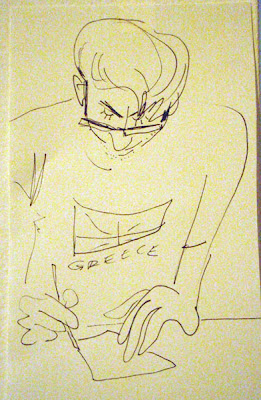


Check out their blogs in JibJab section of links. They're cool dudes (:

Here are some of mine.


Check out their blogs in JibJab section of links. They're cool dudes (:
Thursday, May 19, 2011


Friday, May 13, 2011
portraits
Some portraits for painting. First was 2 class sessions, second was just one class (but smaller canvas!)


Monday, July 26, 2010
as of late
Relatively recent miscellanea!


True story. Good luck trying to copy/paste pieces of money in photoshop too. Had to scan in with acrobat reader and the shift the hues before copying and then shift them back again after pasting.

3 unrelated images layered up in photoshop. Fun stuff.

Saw this dude in the student union on my way to the computer lab. Instead of doing whatever I was supposed to I had a new important mission. You just can't pass up purple polo w/ sweater vest.


True story. Good luck trying to copy/paste pieces of money in photoshop too. Had to scan in with acrobat reader and the shift the hues before copying and then shift them back again after pasting.
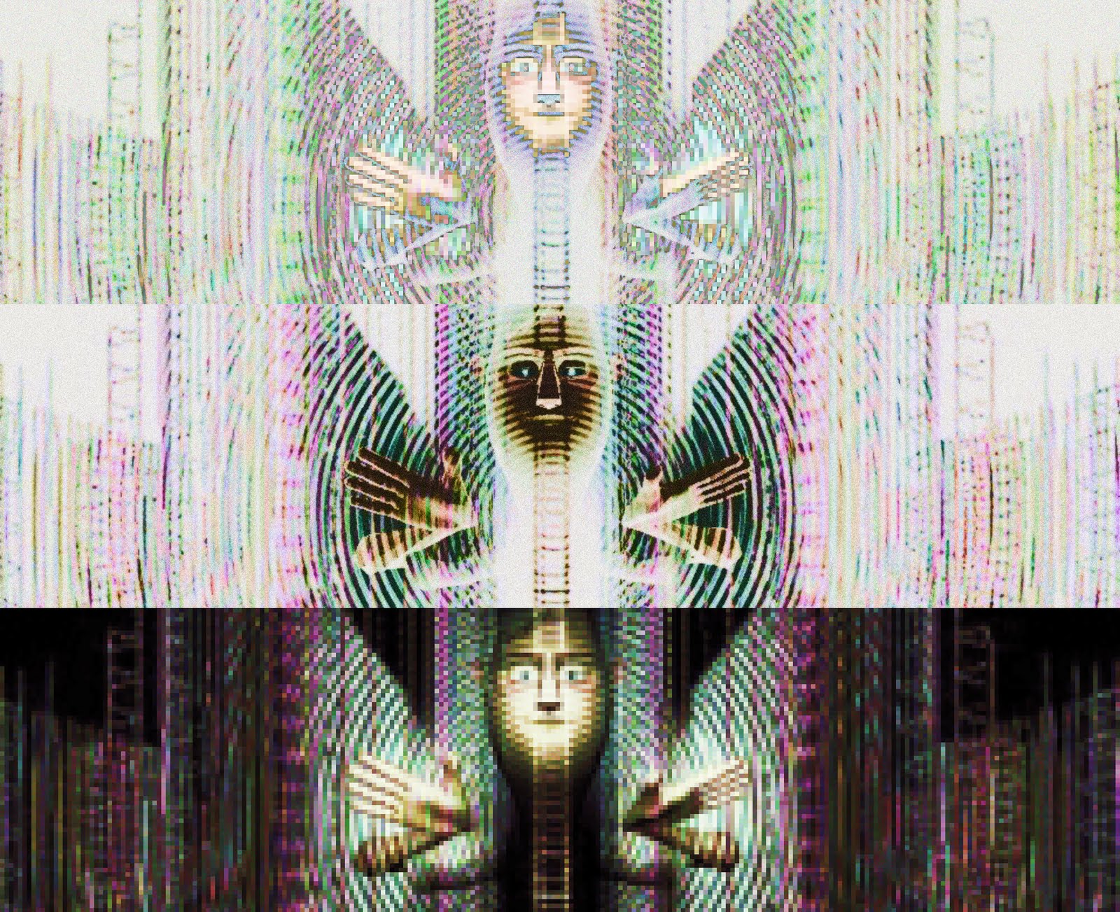
3 unrelated images layered up in photoshop. Fun stuff.

Saw this dude in the student union on my way to the computer lab. Instead of doing whatever I was supposed to I had a new important mission. You just can't pass up purple polo w/ sweater vest.
Tuesday, July 13, 2010
etchings

Yet another post/image dump from last semester, this time from printmaking II, aka etching. I really enjoy printmaking classes. It's nice to get out of the computer labs and work with some real materials. It's also a great class to simply try stuff out in and play with ideas.

My first project was my most ambitious. During the winter I looked at a lot of beautiful work from the amazing Charley Harper (including The Giant Golden Book of Biology). When I got back from winter break I started drawing these simple birds that became more and more stylized and streamlined as I drew them. One day at work I drew some clustered together on a post-it, which ultimately became the basic prototype for this print. You can see the drawing colored over in photoshop at the bottom of this post. This project print used a three plate color separation and aquatints (more on the process of this piece at the bottom of this post). It's an edition of 5 prints which are signed on different sides - as there is no distinct "up" or "down" to these prints as they can be viewed from any side. Some of the birds are based on real life ones including pelican, seagull, flamingo, killdeer, and kingfisher.


Next I did a series of portraits of my CA friends. This was induced by my work at portrait night during the first half of the semester. I wanted to bring what I was doing there over into prints and at the same time explore the concept of portraiture through technique. The prints are on a full sheet of paper (22x30") and the print itself is made up of 9 separate coper plates that are 2x3". After several experiments with ink I decided on a mixture of ink base with a touch of black which gave nice gray prints that looked almost like graphite. The extreme amount of base had the unexpected effect of yellowing into a gold color within a few days, which I came to like.
For these plates I used a process called deep etch where you block out the plate and etch it for a couple hours, leaving large areas exposed to the acid which flat bite. The areas that flat bite consequently don't hold onto the ink and mostly wipe clean, leaving some ink clinging to the inside edges of the recess which then prints. Highlights were painted out while my friends sat for me and then after the asphaltum had dried I went back in with a scribe drawing in more detail from a photo.
Special thanks to my friends who took the time out to sit for me!
Tim Palmer
Adam Campbell
Josh Garlick
Matt Sullivan
Gordon Pinkerton
Betsy Bauer
Stevie Lewis
Alberto Beguerie
Uri Lotan
You guys are awesome!


My final project came from looking at glitch art for the first real time. It's everywhere and it's awesome. Most of my time on this project was spend in research and idea development on the computer because I was so unacquainted with the genre and hex editing (another post to come on that later as well).
I find the idea of translating something that's not am image into an image file to display graphically. Originally I wanted to get a RAM dump off of a computer, but my googling around told me pretty quickly that something like that would be near impossible with my level of computer knowledge. So, I turned to other files like logs, but couldn't find any that met my expectation, so I ultimately went with notepad.exe and translated it into a bitmap image by writing he image header and then dumping the file into the body of the file and filling the end with the necessary zeros.
The print itself is made in the following way: I printed out an enlarged and photoshoped version of notepad.bmp on the laser printers and then lacquer transfered the image to japan paper by hand so I could get a more imperfect transfer. Then I roughed the paper a bit, taking off the top layer of the transfer in a few places, then I stained the paper with acrylic gouache. Then using a template I cut out the rounded square from the japan paper which would ultimately be the the screen. The actual etching is a simple line etching printed with black ink. The substrate, as you can see, is a cardboard box. I saved all my cereal boxes through the year to recycle, so I conveniently had quite a few hand by the spring. On each box that I printed on I pulled up some of the top layer of the paperboard in the lower left corner (the signature and numbering of the edition is done in a similar way in the right corners). To print I dampened the cardboard with a spray bottle of water and ran it through the press with the inked up plate with the japan paper square with some glue on it's back over the computer screen. Printing it presses the japan paper to the cardboard, gluing it, and then the image is printed on top at the same time. The process is known as chine-colle, and is really cool. I'd like do do more work exploring it's possibilities further.

This is what it looks like to make an etching. That jar has asphaltum in it. It's very much like asphalt and full of tar and all sorts of other wonderful things. Whatever you block out on a plate wont react when placed in acid. The acid eats away at the uncovered area and creates a recess. During printing the ink gets in these recesses and stays once the plate is wiped. Lines and areas that aren't real thin will flat bite if they are not given a texture through a process like aquatinting (we spray the plate with a coat of spray paint =~ 50% dot pattern which blocks out those dots from etching and gives the plate some "tooth" to hold onto the ink in those areas when wiping. Because my lines weren't thin I had to use the aquatint process to create then and so had to paint around all my lines and other dark blue areas. Doing that took a very very long time, much longer than I ever expected (about 10 hours per plate if I remember correctly, probably more for the first one). To draw out the birds (because I didn't have a draft made up separately) used a waterbased marker and drew directly on the plate. Once I was done blocking out my plate I cleaned off the marker and tarnish that had developed in a water/vingar rinse and a light polish.

At this point my main plate looked like this. I then applied the spray paint for the aquatint, and once that was dry I put it in the acid to etch for several minutes.

The etched plate looks super cool when cleaned :). Next I ran a test print of this plate, then scanned the print, and then created the mock up for the colors/tinting/separation in photoshop. I then separated each layer of color and printed off a page with all of them so I could use it as a diagram to follow while working, knowing what to block out, what to not block out, and to make sure I didn't forget anything. The red plate was extra tricky because I wanted two levels of red, a light, and a more intense one. To do that I had to etch the plate twice, blocking out all the white areas first, then the light areas for the second etch.

When making the color plates I would have to print the main plate on paper, then run it back through the press with the color plate exactly where the main one was to transfer the image to the plate. Once it was transfered I took a scribe to delineate the edges of that shapes that I intended to block out (the light lines scratched into the plate above). Once all three plates for the the blue, red, and green were made I could print them all together. To do this all plates had to be inked up and wiped and then printed one after the other in the exact same place so they would register. Because of the inks I was using wiping the plates was taking way too long, but paper wiping helped to pick off the plate tone much much quicker. Registration was such a pain. The plates, while really quite close in size, didn't match up completely, despite being cut and filed carefully, transference of images, along with drawing over them, only served to compound any possible error, plates and paper could shift slightly in printing and just to make matters worse, the plates actually started to warp during the printing of the edition. All in all it wasn't too bad though, and I was able to touch up a lot of spaces with watercolor afterwards.
Sunday, February 7, 2010
gold paint is fun
Here's some stuff from the past two portrait nights. I like finding a stylistic constraint/goal and working with that during those three hours. It's really nice to be able to explore these ideas over the course of multiples while at the same time being flexible and free by not being committed to a serious/legit concentration of work. For example the golden portraits were started with Scott's when I painted his beard in bronze gouache and I just kept on with it because I kept having left over paint and didn't want to waste it. I'd like to keep trying to explore different aesthetics, methods, colors, materials, and exaggerated drawing styles in particular. In the immediate future I'd like to do some stuff with soft pastels, mixed media/collage, and maybe even work with these as etchings... Gouache works pretty nicely in washes - keeps that color vibrancy up, and printmaking paper scraps are fantastic to work on, but not vellum, that stuff can not get wet; I still need to figure out what I can do with all my left over vellum.


Got some stuff from FEWS too. I'm trying to go to it just about every night for an hour as a break from work in the labs. I realized after last semester that I wasn't drawing nearly enough and was starting to lose touch with things. My observational and expressive skills have slowly shifted but I feel that my overall drawings have gotten a lot weaker as of late. I really need to pay close attention to things, get off the line again, and get back to being aware of mark making, the quality of which I've been severely neglecting...


Got some stuff from FEWS too. I'm trying to go to it just about every night for an hour as a break from work in the labs. I realized after last semester that I wasn't drawing nearly enough and was starting to lose touch with things. My observational and expressive skills have slowly shifted but I feel that my overall drawings have gotten a lot weaker as of late. I really need to pay close attention to things, get off the line again, and get back to being aware of mark making, the quality of which I've been severely neglecting...


Subscribe to:
Posts (Atom)